Seven Fabulous ebook covers
If covers are tricky things, series covers are even trickier. Not only do you need a cover that attracts the right sort of readers for your book, but it needs to be similar enough to the other covers in the series so that it's obvious at first glance the book is part of something bigger... though not so similar that it looks like the same book.
This is where print books have a distinct advantage over ebooks. If you turn to the back cover of a paperback, you'll often find small images of other books in the series. For example, this is the back cover of HarperCollins's original paperback version of "The Cleopatra Curse", showing the other six covers in a colourful row as they might look in an author's fantasy bookshop:
In fact, what you'll probably find on the shelf of a bookshop is more like this (without Anubis standing guard):
Or, more likely (without the unicorns):
(And I bet you wanted one of the missing ones...!)
Well, the unicorn is never fazed by a challenge. I told him my Seven Fabulous Wonders ebook covers needed to be:
1. Simple enough to look good at thumbnail size.
2. Sophisticated enough to look good at full size on a colour tablet or e-reader.
3. Look good in black-and-white on older Kindles.
4. Look similar to the other six books in the series, but different enough so that readers know that they are seeing a different title.
5. Advertise all the other books in the series.
When I did the first e-covers for the Seven Fabulous Wonders series, I used my favourite silhouette trick to replace the artwork on the paperbacks. I photographed these against the same background, to which I'd added some stars by hand to suggest the magical side of these stories. I then fiddled around with the colours to match the original paperbacks, in case readers were still searching for missing titles when these books went out of print, colour apparently being one of the triggers for remembering a cover.
This had mixed results. I quite liked the cover I did for "The Great Pyramid Robbery" and the one for "The Cleopatra Curse", maybe because I like orange but probably because the contrast works best for that colour:


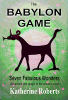
I wasn't too keen on the red for "The Babylon Game", and tried it in green for a while:

And "The Mausoleum Murder" never did suggest an ancient murder mystery to me, being blue originally, which I later changed to purple in an effort to make it a bit more mysterous:

I then published an omnibus edition with all seven titles, and hit on the idea of using the seven rainbow-coloured covers as a border. This worked better than I expected, even at small size:

But this cover, in particular, was quite girly with its pastel colours, whereas I know the original books were enjoyed by boys as well. So I knew I would have to redesign the covers for the entire series at some stage. with seven covers to tackle, I put this off until I decided to make my ebooks available for e-readers other than the Kindle, and discovered that my original covers were now too small to meet the requirements of some ebook stores. That was the kick I needed.
Keeping the original silhouettes, and the idea of a border for the omnibus, I decided to go for a completely new look and try a more sophisticated black background. I had to reverse the silhouettes, of course, to avoid a total blackout - but that's easy enough in photo-editing software. Then I added a bit of colour to the titles and around the silhouettes, and ended up with this for "The Great Pyramid Robbery":

Abandoning the original colour scheme - readers of the original paperbacks now grown up - enabled me to play around with the colours until I got a satisfyingly green Babylon Game, and finally, with the newly-released red, a proper crime story feel for "The Mausoleum Murder":

I then added a jewel-like border made from the seven covers (as before) for the omnibus edition, and ended up with this:
Finally, since the simple black covers work quite well at thumbnail size but looked a bit basic when blown up to full screen size, I tried adding the border from the omnibus to each of them and finished with a set of covers that also advertise the other books in the series, therefore doing the job of the paperback cover in the first picture above.
Here is "The Mausoleum Murder" with the border added:
To be honest, I am still in two minds about this last step, since people mostly see the covers at thumbnail size when browsing online, and on my black-and-white Kindle they all look rather samey. Since there is a danger readers might not notice the different titles at a glance if they all have borders, I am thinking the simpler versions might work better for the individual books on Kindle, leaving the border just for the omnibus. But the beauty of e-covers is that you can change them without going into a lot of expensive printing, so I am trying the more sophisticated border versions first to see what happens.
Like? Not much different? Total disaster? The unicorn would love to know what you think...
Good news for those people without Kindles! The Seven Fabulous Wonders titles are now on their way into the Apple, Kobo, and Nook stores. (The books can be read in any order, so you can ignore the series number where it is listed.)
Click here for Amazon Kindle UK
Click here for Amazon Kindle US
Click here for Kobo
Click here for Nook (US only so far... but watch this space.)
Apple itunes - Sorry, no quick link! You need to install itunes, then search for "Seven Fabulous Wonders" in the itunes book store. Mac users and those with an ipad/iphone should already have this.
This is where print books have a distinct advantage over ebooks. If you turn to the back cover of a paperback, you'll often find small images of other books in the series. For example, this is the back cover of HarperCollins's original paperback version of "The Cleopatra Curse", showing the other six covers in a colourful row as they might look in an author's fantasy bookshop:
 |
| The gorgeous HarperCollins cover of "The Cleopatra Curse" |
In fact, what you'll probably find on the shelf of a bookshop is more like this (without Anubis standing guard):
 |
| The spines are usually what you see first in a bookshop. |
Or, more likely (without the unicorns):
 |
| My books with some titles missing. |
(And I bet you wanted one of the missing ones...!)
Well, the unicorn is never fazed by a challenge. I told him my Seven Fabulous Wonders ebook covers needed to be:
1. Simple enough to look good at thumbnail size.
2. Sophisticated enough to look good at full size on a colour tablet or e-reader.
3. Look good in black-and-white on older Kindles.
4. Look similar to the other six books in the series, but different enough so that readers know that they are seeing a different title.
5. Advertise all the other books in the series.
When I did the first e-covers for the Seven Fabulous Wonders series, I used my favourite silhouette trick to replace the artwork on the paperbacks. I photographed these against the same background, to which I'd added some stars by hand to suggest the magical side of these stories. I then fiddled around with the colours to match the original paperbacks, in case readers were still searching for missing titles when these books went out of print, colour apparently being one of the triggers for remembering a cover.
This had mixed results. I quite liked the cover I did for "The Great Pyramid Robbery" and the one for "The Cleopatra Curse", maybe because I like orange but probably because the contrast works best for that colour:


I wasn't too keen on the red for "The Babylon Game", and tried it in green for a while:


And "The Mausoleum Murder" never did suggest an ancient murder mystery to me, being blue originally, which I later changed to purple in an effort to make it a bit more mysterous:

I then published an omnibus edition with all seven titles, and hit on the idea of using the seven rainbow-coloured covers as a border. This worked better than I expected, even at small size:

But this cover, in particular, was quite girly with its pastel colours, whereas I know the original books were enjoyed by boys as well. So I knew I would have to redesign the covers for the entire series at some stage. with seven covers to tackle, I put this off until I decided to make my ebooks available for e-readers other than the Kindle, and discovered that my original covers were now too small to meet the requirements of some ebook stores. That was the kick I needed.
Keeping the original silhouettes, and the idea of a border for the omnibus, I decided to go for a completely new look and try a more sophisticated black background. I had to reverse the silhouettes, of course, to avoid a total blackout - but that's easy enough in photo-editing software. Then I added a bit of colour to the titles and around the silhouettes, and ended up with this for "The Great Pyramid Robbery":

Abandoning the original colour scheme - readers of the original paperbacks now grown up - enabled me to play around with the colours until I got a satisfyingly green Babylon Game, and finally, with the newly-released red, a proper crime story feel for "The Mausoleum Murder":

I then added a jewel-like border made from the seven covers (as before) for the omnibus edition, and ended up with this:
 |
| Click here to see the Kindle edition |
Finally, since the simple black covers work quite well at thumbnail size but looked a bit basic when blown up to full screen size, I tried adding the border from the omnibus to each of them and finished with a set of covers that also advertise the other books in the series, therefore doing the job of the paperback cover in the first picture above.
Here is "The Mausoleum Murder" with the border added:
 |
| Kindle edition |
To be honest, I am still in two minds about this last step, since people mostly see the covers at thumbnail size when browsing online, and on my black-and-white Kindle they all look rather samey. Since there is a danger readers might not notice the different titles at a glance if they all have borders, I am thinking the simpler versions might work better for the individual books on Kindle, leaving the border just for the omnibus. But the beauty of e-covers is that you can change them without going into a lot of expensive printing, so I am trying the more sophisticated border versions first to see what happens.
Like? Not much different? Total disaster? The unicorn would love to know what you think...
***
Good news for those people without Kindles! The Seven Fabulous Wonders titles are now on their way into the Apple, Kobo, and Nook stores. (The books can be read in any order, so you can ignore the series number where it is listed.)
Click here for Amazon Kindle UK
Click here for Amazon Kindle US
Click here for Kobo
Click here for Nook (US only so far... but watch this space.)
Apple itunes - Sorry, no quick link! You need to install itunes, then search for "Seven Fabulous Wonders" in the itunes book store. Mac users and those with an ipad/iphone should already have this.